Key Features
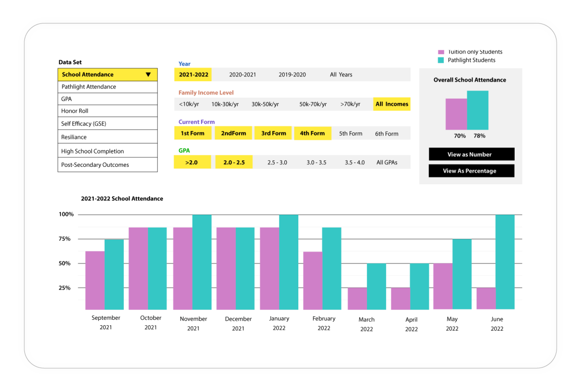
Interactive Data Visualization: I designed a feature-rich interface that enables users to explore various data sets with dynamic filters. This allows administrators to tailor their reports to specific needs, making complex data accessible and understandable.
Comprehensive Reporting: The tool supports the creation of detailed reports. Through careful UI/UX design, I ensured that users can easily generate professional reports that highlight key metrics and outcomes, crucial for stakeholder presentations.
Comparative Analysis: Utilizing a color-coded system—pink for Pathlight and teal for traditional education—the interface facilitates easy comparison and analysis. This visual differentiation helps users quickly grasp the relative effectiveness of the Pathlight program.
User-Centric Design: The interface is designed with administrators in mind, prioritizing usability and intuitive navigation. This focus on user experience ensures that users can efficiently analyze data and generate impactful reports.

Design Process
My role in the Pathlight project involved a comprehensive approach to UI/UX design:
User Research: Conducted extensive research to understand the needs of administrators and the key metrics they focus on for reporting educational effectiveness.
Wireframing and Prototyping: Developed wireframes and interactive prototypes to map out the user journey and interface elements. This iterative process ensured a user-centric design.
Visual Design: Created a clean and professional visual design, emphasizing clarity and ease of use. The use of color coding (pink for Pathlight and teal for traditional education) was integral to the comparative analysis feature.
Usability Testing: Conducted usability tests to gather feedback and refine the interface. This step was crucial in ensuring that the final product met the needs of its users.
Skills used: Illustrator, UX design, Data Visualization
Programs Used: Adobe Illustrator